

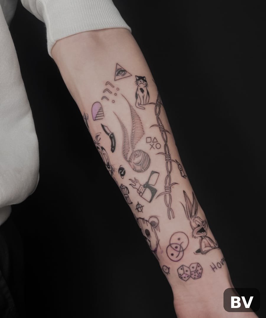
Look at your sleeve in a mirror, not at your phone photos of it. See those little islands of bare skin floating between the pieces you love? They are not flaws — they are unfinished business. Every collection of tattoos, whether it was planned as a sleeve or assembled piece by piece over ten years, ends up with these empty pockets.
Filler is the quiet hero that solves them. Unlike the main pieces that define a sleeve’s subject, filler is chosen for its shape, not its meaning — it exists to bridge, cushion and connect. The trick most people miss is that the best filler is picked for the gap it will live in, not for how it looks on a flash sheet.
This list of 30 tattoo filler ideas is organised exactly that way: by the size and shape of the gap you need to close. Tiny pinpoints, long narrow channels, awkward joint corners, wide open patches, unifying textures and edge framing — find your gap type below, pick the idea that fits it, and for more body-art inspiration, Beverly Magazine has you covered. Your arm will thank you.
Tiny Pinpoint Gaps
These are the thumbprint-sized blanks — a little empty spot where two pieces nearly touch. They need the smallest possible ideas, placed with precision. Anything bigger will crowd the main pieces.
1. Single four-point sparkle. One tiny starburst mark, no larger than a pea, placed dead centre in the gap. It reads as a glint of light rather than a design, so it never competes. The smallest sparkles heal in days and cost almost nothing to add at the end of a session.
2. Micro dot trio. Three dots in descending sizes, arranged in a loose triangle. They fill the smallest awkward triangles where three tattoos almost meet, and the graduated sizing makes the gap look deliberately textured instead of forgotten.
3. Tiny dot constellation. Five or six pinprick dots in the shape of a real or invented constellation, without connecting lines. The eye fills in the pattern, so a nearly invisible gap suddenly looks like a miniature night sky. Keep the dots spaced at least 2mm apart or they merge as they heal.
4. Mini crescent moon. A fingernail-sized crescent tucked into a curved gap. Its arc naturally follows the edges of neighbouring pieces, which makes it look designed-in even when the gap was accidental. Moons stay legible for years because the shape is simple.
5. Micro lightning bolt. A small jagged bolt that adds a jolt of energy to an otherwise soft sleeve. It suits bold linework and traditional pieces, and its narrow shape slides into vertical slivers of skin that nothing rounded would fit.
6. Tiny heart outline. A simple line-drawn heart, smaller than a fingernail. Sweet without being sentimental, it works as a softening counterpoint if your sleeve is heavy on skulls, daggers or dark imagery. Fine outlines age best when kept truly minimal.
Narrow Channels and Tight Curves
Long thin gaps — the lane between a forearm piece and a wrist tattoo, the channel running down the inner arm. These need linear filler that follows the curve of the limb rather than fighting it.
7. Fine-line chain link. A delicate chain running along the channel, each link drawn in thin linework. Chains curve, taper and wrap, which makes them almost unfairly good at fitting spaces no solid shape could occupy. Ask for broken or fading links at the ends so it dissolves into the skin.
8. Trailing vine with leaves. A single stem that meanders down the channel with small leaves sprouting off it. Because vines are naturally irregular, they forgive wobbly gaps and uneven edges — the asymmetry is the design. A favourite for patchwork sleeves where nothing was planned to connect.
9. Dotted connector line. A soft dashed line of graduated dots linking two tattoos, like a seam or a constellation trail. It is the quietest possible fix for a gap too narrow for any subject, and from more than a metre away it is nearly invisible.
10. Roman numeral date. A short date — a birth year, an anniversary — in small serif numerals set vertically down the channel. It slips into thin spaces, carries personal meaning, and the classic letterforms hold their crispness far better than script at small sizes.
11. Single meaningful word. One short word in lettering matched to your sleeve’s mood, running along the channel. Keep it to a single word; phrases become unreadable at this scale and blur into smudges within a few years. Match the lettering weight to your existing linework.
12. Whip-shaded feather spine. A thin central line with fine feathering strokes tapering off both sides, drifting down the channel. It adds softness and movement without a single hard outline, and the fading ends mean it can stop exactly where the gap ends.
Awkward Corners and Joint Spots
Elbows, the wrist, behind the ear, the crook of the arm — spots that move constantly or sit at odd angles. These gaps need designs built for motion and curvature.
13. Elbow spiderweb. The all-time classic for the point of the elbow. A radial web is literally designed around a joint that bends all day, and it frames the bone instead of fighting it. Know what you are signing up for: the elbow is one of the famously spicy spots to tattoo.
14. Cropped mandala section. A partial mandala cut off by neighbouring pieces or the edge of the limb. Mandalas have a rare property: they can be cropped and still look complete, which makes them ideal for rounded, awkward corners. The radial structure gives the eye a resting point between busier subjects.
15. Swallow in flight. A small traditional swallow with outstretched wings, angled across the corner. The wings fill a triangular space efficiently, and swallows carry the old sailor meaning of safe return. They look best in pairs, angled as though mid-flight through the gap.
16. Small compass rose. A compact navigational star built for a corner that needs a centre. Its radial points fill evenly in every direction, and it brings a clean geometric anchor to organic or nature-heavy sleeves. Keep it small — enlarged compasses dominate.
17. Chunky ornamental dotwork. A small medallion of dense stippling built around the joint’s point. Dotwork handles curvature gracefully because it has no rigid outlines to distort when the skin stretches, making it kinder to moving spots than fine linework.
Wider Open Patches
The palm-sized blanks — usually on the upper arm or outer forearm — that are too big for a sparkle but not big enough for a new main piece. These want small designs with real presence.
18. Traditional dagger. A slim blade that commands a wide patch without demanding a huge canvas. Its long shape directs the eye vertically, which lengthens the look of the arm. Keep the hilt simple — ornate details get muddy once the patch is viewed at a distance.
19. Bold traditional rose. Heavy outline, simple shading, red and green or straight black and grey. The rose has filled sleeve gaps for a century because the shape reads instantly at any size. Vary the angle and bloom stage from your other florals so it does not look like a flash-sheet duplicate.
20. Moth with spread wings. A medium moth, wings open, filling a wide patch with moody nocturnal energy. Moths suit dotwork and blackwork sleeves beautifully, and their symmetrical wings balance a gap that feels lopsided. Ask for subtle wing detail rather than heavy fill so it does not compete with main pieces.
21. Ribbon banner. A flowing banner that can carry a word, a date, or stay completely blank. The curves wrap naturally around arm muscle, and a blank banner is secretly clever — it reserves space for a future addition without looking unfinished.
22. Chrysanthemum bloom. A single large mum in black and grey or colour. In Japanese-influenced sleeves the chrysanthemum is nobility and longevity; visually, its layered petals fill a round patch more completely than almost any other flower. It pairs naturally with waves or clouds nearby.
Texture That Unifies the Whole Sleeve
Sometimes the answer is not another subject but a background layer — something that washes behind the pieces and makes ten separate tattoos read as one arm. This is where patchwork sleeves get truly transformed.
23. Japanese cloud bands. Kumo clouds threading between every subject on the arm. Arguably the most powerful filler ever invented: clouds wrap around anything, scale from a two-inch gap to a whole upper arm, and carry real meaning in the irezumi tradition. The honest trade-off is that they commit your sleeve to a Japanese visual language.
24. Dotwork gradient fade. Dense stippling that fades from dark to bare skin, creating a soft grey field behind or between pieces. It is the gentlest possible transition with no hard edges anywhere. Budget honestly — stipple is applied point by point, so this is slow, session-heavy work.
25. Grey smoke and mist. Soft atmospheric haze with no outlines, drifting behind the main subjects. Smoke is the quietest connector available and belongs in dark, atmospheric arms, especially black-and-grey realism. Protect it from the sun — soft grey is the most fade-prone texture on this list.
26. Pepper shading. Light stippled shading tucked directly behind a main piece so it pops forward. Unlike solid black background, it keeps the sleeve breathable and layered. It is also the most artist-dependent texture here: ask to see healed pepper shading specifically, because fresh photos hide how it settles.
Border and Edge Framing
Instead of filling the middle of gaps, these ideas frame them — outlining edges, drawing horizons, and giving the sleeve a sense of deliberate boundaries.
27. Fine-line band wrap. One or two thin lines circling the arm like a bracelet, passing behind the existing pieces. A band creates a horizon line that organises everything above and below it. On a curved limb, keep it perfectly even — a wobbling band is visible forever.
28. Geometric lattice strip. A narrow band of hexagons, triangles or sacred-geometry fragments running between two rows of pieces. It gives structure exactly where representational subjects create complexity, and the repeating pattern fills a strip fast. Leave some cells empty for a lighter, modern take.
29. Wave and water bands. Japanese-style finger waves filling a horizontal band between subjects with motion and depth. The natural partner to koi, octopus or any marine piece — but they also work as general connectors in Japanese-influenced arms. Plan for a touch-up pass; grey wash often settles lighter than it looks fresh.
30. Framed negative space. The advanced move: instead of filling a gap, your artist outlines it with a thin border, making the bare skin look deliberate. It is the only filler that adds nothing while making everything look planned — but it demands a confident artist with a steady hand.
7 Filler Tips to Know Before You Book
Match the gap first, the style second. Stand in front of a mirror and categorise each blank: pinpoint, channel, corner, patch, texture, edge. A gorgeous cloud band in a pinpoint gap is as wrong as a micro star in a palm-sized patch. The shape of the emptiness should choose the filler family.
Match line weight to your existing ink. A fine botanical sprig beside bold traditional outlines visually disappears, and a chunky dagger beside delicate fine-line work looks like it wandered in from another sleeve. Hold reference images against your arm and squint — if the filler vanishes or screams, the weight is wrong.
Bring your actual arm to the consultation. Not a Pinterest board of isolated designs — photos of your real gaps, from several angles. The best filler is designed for the specific negative space it will occupy. A great artist will map your gaps before suggesting a single design.
Ask to see healed filler work. Fresh filler always looks sharper than it will at year five. Tiny stars, fine script and micro detail all spread slightly as they settle. Healed photos of the artist’s previous filler work are the only honest preview of what yours will become.
Respect cultural weight. Some filler carries serious heritage — batok patterns, tribal motifs, Japanese irezumi elements like kumo and finger waves. Research the meaning behind a shape before choosing it, and for culturally specific work, book an artist trained in that practice. Wearing the look without the understanding is a costume, not a tattoo.
Leave some skin alone. Not every gap needs filling. Negative space is a design element, not a failure, and over-filled sleeves go from breathing to cluttered in a single session. Live with a gap for a month first — the filler you still want after thirty days is the right one.
Protect it from the sun. Fine lines spread, soft greys fade, and small detail merges — and UV accelerates all three. Sunscreen is the single biggest factor in how your filler looks at year ten. Bold, simple filler ages gracefully; delicate filler needs protection to stay delicate.
What exactly counts as tattoo filler?
Tattoo filler is any small design placed in the gaps between larger tattoos to connect them visually — stars, sprigs, dotwork, script, clouds, geometric fragments. It is different from background work, which is the larger shading or scenery sitting behind main subjects. Most finished sleeves use a mix of both, matched to the gap each element fills.
How much does tattoo filler cost?
It depends on size, style and your artist’s rate. Pinpoint filler like a few stars can be a quick add-on at the end of a session, sometimes under an hour of shop time. Full background work — clouds, dense dotwork, solid black — is priced like any large tattoo work, usually across multiple sessions. Always ask for an estimate tied to your specific gaps rather than a generic per-piece price.
Does filler hurt more than the original tattoos?
Not inherently, but placement matters more than the design. Filler often lands in the leftover spots — the ditch of the elbow, the inner bicep, the wrist — which tend to be more sensitive than the outer arm. Tiny filler is over so fast the pain barely registers; large background sessions are long enough that endurance becomes the real factor.
Can filler rescue a sleeve where the pieces don’t match?
Often, yes — this is one of filler’s best tricks. A consistent filler vocabulary running between unrelated pieces, like the same botanical style or the same dotwork texture throughout, can make a decade of random tattoos read as one intentional composition. Be honest with your artist about which pieces you love so the filler flatters the keepers.
Should I get filler before the sleeve is finished?
Generally, no. Filler works best when it responds to actual gaps between actual pieces. Filling space before the main subjects are placed risks boxing yourself in — the filler may clash with a future piece or sit exactly where it needs to go. Finish the subjects first, live with the sleeve a while, then fill deliberately.
Will small filler blur as it ages?
All tattoos spread slightly over time, and small tight detail spreads fastest. Tiny stars with very close points, micro script and dense dot clusters are the most vulnerable. Keep small filler truly simple, give elements breathing room, and choose an artist whose healed work you have actually seen. Simple and well-spaced ages far better than intricate and cramped.
Bottom Line
A finished sleeve is not the one with the most ink — it is the one where the eye travels without stopping. Filler is what makes that happen: the small, deliberate decisions that turn scattered pieces into a composition. Work gap by gap, match the idea to the emptiness, and resist the urge to fill everything at once.
Photograph your arm, sit with the blank spots, and notice which gaps genuinely bother you versus the ones you have simply been told should bother you. The filler chosen deliberately, after living with the question, is the filler you will still love when the sleeve is finally, genuinely finished.
